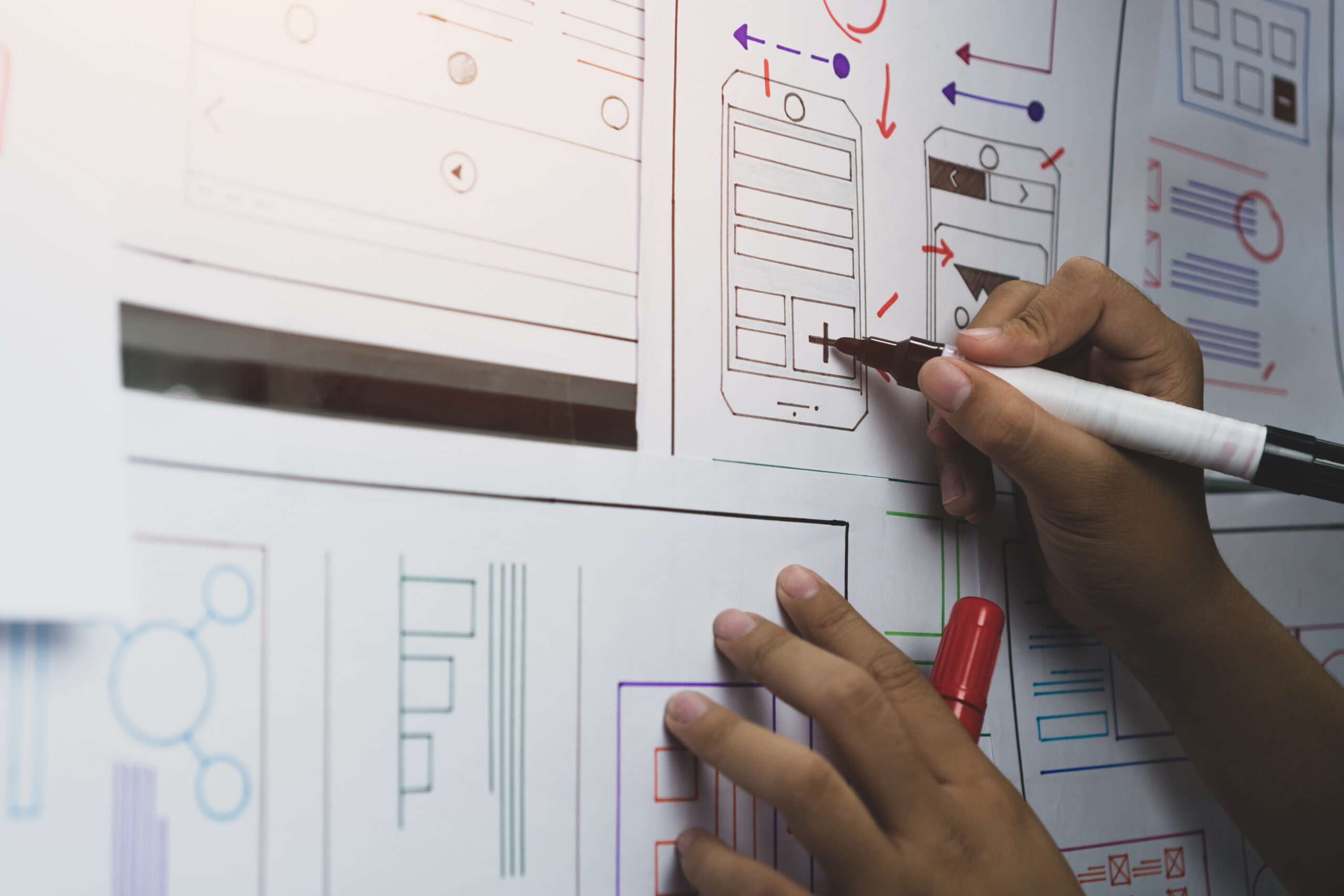
The moment you realize you need one
It usually starts small. A designer ships a page with a slightly rounder button. A developer hardcodes a hex value because the Figma file was out of date. Marketing launches a campaign with its own typography “just for this one thing.”
Six months later, your product has eleven shades of blue, four near-identical button styles, and a checkout flow that feels like it was built by three different companies.
This is the moment teams start whispering the words design system. Let’s cut through the noise and talk about what one actually is, when you need it, and how to build one without losing six months of momentum.
What a design system really is
A design system is not a sticker sheet in Figma or a style guide PDF gathering dust. It’s the single source of truth that connects how your product looks, behaves, and gets built. At its best, it’s three things working together:
- Foundations — colors, typography, spacing, motion, accessibility.
- Components — reusable building blocks like buttons, inputs, and cards.
- Guidelines — the why and when behind every decision.
If it only lives in design tools, it’s a style guide. If it only lives in code, it’s a component library. A real design system bridges both worlds.
When do you actually need one?
Not every team needs one on day one. The signs it’s time:
- You have more than one product or surface to keep aligned.
- Your team is growing and alignment is starting to cost real time.
- Inconsistency is showing up in bug reports.
- You’re shipping slower because you keep rebuilding the same components.
If two of these resonate, it’s time. Waiting longer just makes the cleanup more expensive.
”A design system isn't overhead. It's the difference between a team that ships and a team that argues about buttons.
The building blocks: tokens, components, patterns
Design tokens are the smallest decisions in your system, expressed as named values. Instead of writing #0066FF in fifty places, you write color.primary.500. Change one value, everything updates.
Components are tokens assembled into something useful — a button, an input, a card. The key is composition over duplication: one Button with variants, not five separate buttons.
Patterns are how components combine to solve recurring problems: login flows, empty states, confirmation dialogs. This is where your system stops being a kit and starts being a language.
Bridging design and development
This is where many systems fall apart: design and engineering speak different dialects. The fix is tooling that lets both sides work from the same source of truth.
Figma is the default for design, with variables and shared libraries that mirror engineering reality. Storybook is its counterpart for developers — a sandbox where every component lives with all its variants, states, and docs.
When tokens flow from Figma to code and component props stay in sync across both, designers and developers stop arguing about pixels and start collaborating on real product decisions.
How to start without burning out
The biggest mistake is trying to build everything at once. A design system isn’t a big-bang launch — it’s an ongoing product. A sane sequence:
- Audit what you have. Screenshot every button, form, and card. The mess will be motivating.
- Define your tokens first. Get colors, type, and spacing right and 80% of consistency follows.
- Build your five most-used components. Usually: button, input, card, modal, navigation.
- Document as you go. A component without docs is a trap.
- Treat it as a product. Assign owners, version it, ship updates.
A focused set of ten well-documented components beats fifty half-finished ones every time.
The headache isn’t the system. It’s not having one.
The good design systems quietly become the most valuable infrastructure in a company. They speed up shipping, raise the quality floor, and free your team to focus on the problems that actually matter.
You don’t need one because it’s trendy. You need one because at some point, your team will spend more time aligning on the color of a button than designing the next great feature.
Thinking about building or rescuing a design system? That’s exactly the kind of work we love. Whether you’re starting from scratch or untangling years of drift, we’ll help you build a foundation your team can actually grow on.